Succeeding with direct mail can be a very complex task.
Understanding what makes a mail piece do well (or poorly) can be a bit mysterious.
What I've found is that there are MANY aspects of a direct mail campaign that need to be executed flawlessly to get a good response rate.
One of the most crucial aspects is the message you are trying to deliver to your recipients.
As obvious as this should be, I consistently encounter a lot of cheesy, poorly written, and generally thoughtless messages in the ads, letters, and websites people use to find motivated sellers.
Maybe it's a lack of creativity. Maybe these people just don't understand the psychology behind written communication. I'm honestly not sure… but it's hurting them.
For example, it's not enough to blast out a message like this:
WE BUY HOUSES!
555-555-5555
CALL NOW!
Will people respond to this kind of message?
Some probably will… but not many.
Why isn't this kind of message sufficient?
Because EVERYBODY else in your market is saying the same thing, there is absolutely nothing unique about this kind of mail solicitation.
If you want people to take notice of the mail you're sending them; you need to look different. If you want to grab someone's attention, you need to stand out from the crowd.
What stands out to you when you get a mail solicitation in your mailbox?
When you only have a split second to grab your recipient's attention, you need to immediately show them why you're worth paying attention to and ultimately, you need to move them to action.
I'll admit – it's not always naturally intuitive to look different. So how on earth do you do this?
Luckily, there are a lot of ways to pull it off.
I've experimented with several different messages and mail formats over the years. After trying dozens of different approaches (some of which succeeded, and some of which FAILED miserably), these are my Top 3 postcard formats that have consistently produced the best results for me.
RELATED: A Closer Look At My “Blind Offer” Template
(Note: To avoid stifling your creativity, the examples below don't contain the exact verbiage of my postcards. If you want more information on the precise words that I use in my letters, you can order them at the bottom of this blog post)
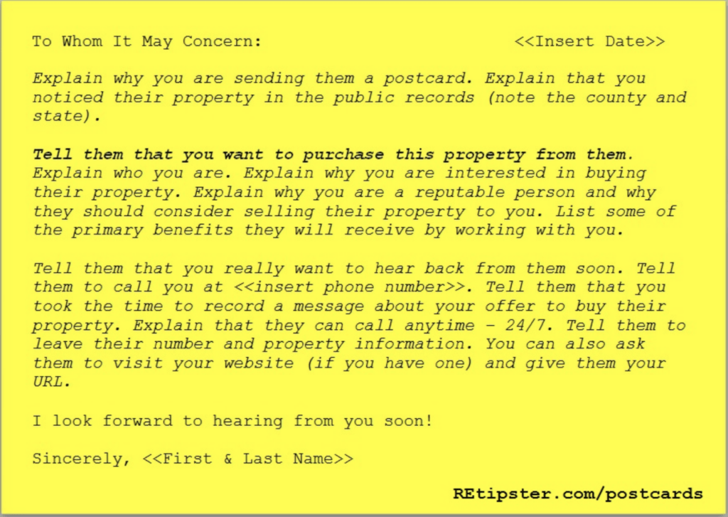
Template #1 – The Personal Letter
Why Does This Get Noticed?
This postcard says, “I took the time to write you this personal letter, so you should pay attention to what I'm saying.”
Think about it for a second – if you received a postcard like this in the mail, would you take the time to read it? My theory behind why this postcard has worked so well for me is that it doesn't look like all the other junk mail that people get.
The goal with this postcard isn't to be flashy. The goal is to be real. When a mail piece comes blasting out of the gate with “SELL! SELL! SELL!”, people don't pay attention to it because that's what everybody else does. As odd as it may sound, being down-to-earth is different, and people notice that.
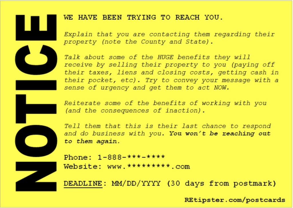
Template #2 – THE FINAL NOTICE
Why Does This Get Noticed?
This postcard says, “You need ME more than I need you.” This can strike a chord with some people (especially if it's true – and they know it).
While this postcard has been slightly less effective than Template #1 in my rounds of testing (for reasons I can't completely pinpoint), it still pulls in many responses for me consistently.
This template instills a sense of urgency and will likely catch more attention than the generic “WE BUY HOUSES” message that everybody else can't think outside of.
This concept of including a great, big NOTICE on a postcard message was originally conceived in the 80s by Richard Roop, a real estate marketing wizard. He has developed many proven direct response marketing ideas.
The copy of the actual message should be written for your specific audience, but whoever you're speaking to, it'll be hard for them to ignore this kind of design.
Template #3 – The Double-Sided Message
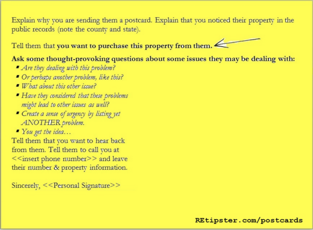
Back Side:
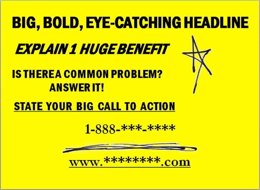
Front Side:
Why Does This Get Noticed?
This postcard takes the approach of asking questions and getting the recipient to think a little. “What is your situation? Perhaps I can help you?”
One look and you will see that this is the flashiest postcard I have. The benefit of using this card is partially in the choice of words, the hand-drawn graphics, and the fact that it's double-sided (which means we've got two chances to make a first impression).
Side one is your big, bold, attention-grabbing statement.
Side two is the personal message (a similar approach to Template #1).
One thing that probably stood out to you when you first saw this postcard is the hand-drawn star, lines, and arrow…
Am I right?
Well, they work. In terms of “attention-grabbing,” I wouldn't be surprised if they're more powerful than the actual headline and letter on the postcard. These graphics tend to do the trick.
Do QR Codes Ever Make Sense on Postcards?
It's also worth noting QR codes may make sense in some contexts.
Why bother with a QR code? Because these can be used to minimize the action required by the recipient.
If you use a mail service like Rocket Print and Mail, they can implement all kinds of cool strategies with QR codes. Not to mention, if you use the REtipster referral link, you can get big discounts on all the mail you order. Just let them know you're coming from REtipster!
Get Started With Rocket Print!
For example, when a QR code is scanned (which will happen automatically with the camera app on every iPhone), it can do any of the following things:
- Send the user directly to a specific website URL
- Automatically dial any phone number
- Automatically send an SMS text message
- Add contact information to the user's phone
- Play a YouTube video
- Download a pdf
- Generate a Calendar Invite
- Give directions to any location
If you want your recipients to visit your website, call you, email you, or do anything else, you can potentially make this happen faster and easier if you give them the option of using a QR code.
The biggest trick is to ensure people understand what to do with it (because many people won't).
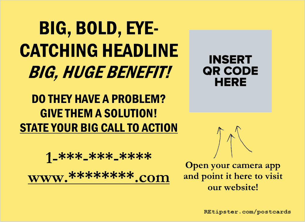
If you want to make it obvious, put some instructions directly beneath or beside the QR code on your postcard, like this…
QR codes are NOT a necessity for a successful mail piece or campaign (and if they aren't used carefully, they can detract from the central message more than they contribute), so if you decide to use one, make sure you're using it for the right purpose and make it very clear to your recipients how they can use it.
RELATED: QR Code Ideas for Realtors and Real Estate Investors
What Gets the Best Response Rate?
It's difficult to know why some mail campaigns do well and others don't.
The first time I tried a direct mail campaign, I had no idea what I was doing.
I got a delinquent tax list from a nearby county treasurer's office (note: this type of list contains some highly motivated sellers, which plays a BIG role in every successful campaign); I put together a basic postcard (similar to Template #1), and did a trial run, blasting out 106 postcards with an online mailing service.
To my shock, I got a whopping 6% response rate (which, in the eyes of most direct mail marketers, is pretty darn good).
Figuring it must have been a fluke, I tried another campaign two weeks later with 300 postcards. My response rate was 14%.
I started to realize I was onto something, and I was!
RELATED: How I Find Motivated Sellers (And Get Them Calling Me)
These templates have been very effective for me over the years, but not every campaign is guaranteed to be a home run.
I'm not going to guarantee you'll find success with postcards because many different variables will influence the outcome of each campaign. The message is very important, but it's not everything.
If you're working with old data, sending mail to unmotivated sellers, or trying to find deals in a highly competitive market, all of these things can hurt your response rate.
However, one of the strongest assets you can have as a direct mail marketer is a compelling message that speaks effectively to your recipients and that people cannot ignore. It will make a difference when you're saying the right thing.
The Message Isn't Everything
As I mentioned, the message you send is one of many variables that need to be mastered in your direct mail campaigns.
Several other important variables need to be fine-tuned too. That being said, this whole process isn't even worth doing if you're not going to pack a solid punch with your message.
Remember the importance of looking different. Be real, and you won't have any problems standing out from the crowd.
Want To See The Exact Postcards I Use?
As you can see, the examples above are meant to show you the format of my postcards, but not the exact wording. I do this because I don't want to dictate what you do with your letters.
You may very well be a better writer than me, so I don't want to imply that my postcards are the best letters ever written.
On the same coin, I have spent thousands of dollars and years of my life testing, re-testing, and RE-re-testing these templates to come up with the final product I use today.
There is nothing particularly “magical” about the wording I use; I've just invested a lot of my time and resources to refine this type of written communication – to the point where I have a pretty solid grasp on getting responses from the right people.
You can do the same thing. If you want to spend years of your life and invest thousands of dollars into “testing the waters,” I am 100% sure you can come up with some postcard templates that are just as effective…
…or you can save yourself a lot of time and frustration and use the same templates I do (and just for kicks, I'll throw in a couple of extra bonus templates, eye-catching graphics, a few templates you can use with Rocket Print and Mail, and a video tutorial to help you along the way).
Note: When you sign up as an REtipster Email Subscriber, I’ll send you an instant $20 off “Discount Code” for this item.
Also, this item is available for free in Module 2, Lesson 7 of the Land Investing Masterclass, and Module 2, Lesson 3 of The Beginner's Deal Finding Guide.
There's no pressure – just want to make sure you're aware.


